This project provides an analysis of the dataset provided by Pronto CycleShare data that was made available in 2015. It is inspired by the analysis done by one of the Data Science Fellow’s here at University of Washington, Jake Vanderplas. The project involved the use of NumpPy, Pandas for the data analysis part and the use of Matplotlib and Seaborn for interesting plots and visualizations that we can observe below. Following is the snippet to obtain count of trips by date.
by_date = trip_data.pivot_table('trip_id',aggfunc = 'count', index='date',columns ='usertype')
fig, ax = plt.subplots(2, figsize=(16,8))
fig.subplots_adjust(hspace=0.4)
by_date.iloc[:,0].plot(ax=ax[0], title='Annual Members');
by_date.iloc[:,1].plot(ax=ax[1], title='Day-Pass Users');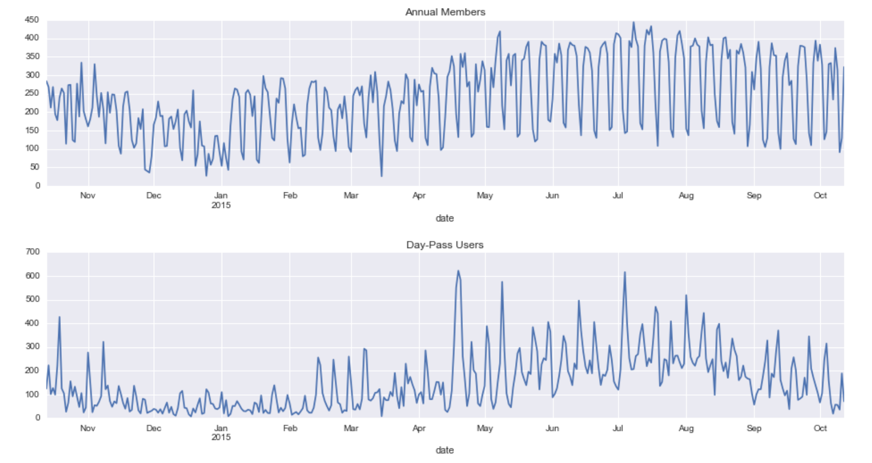
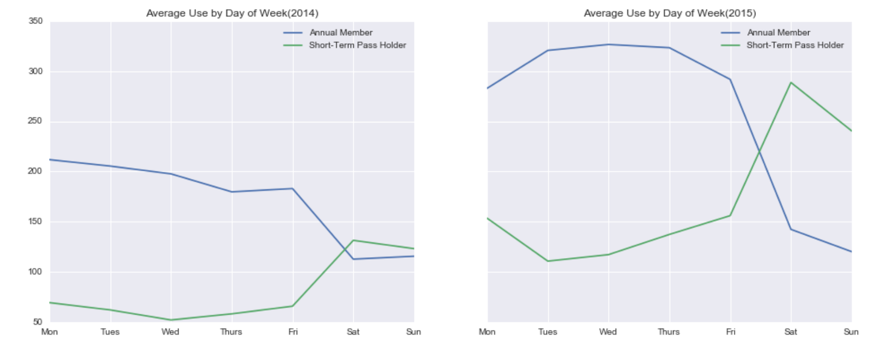
In the above figure we can see the plot between the count of trips made by date. It is segregated by the type of membership that a user has viz Annual Membership or Day-Pass. We observe how the trip made by Day-Pass user’s changes in line with the seasons. While the usage of Annual members is more frequent and regular. Let us go a little more granular and look at an average of the trips by week.
by_weekday.columns.name = None
fig, ax = plt.subplots(1, 2, figsize =(16,6), sharey = True)
by_weekday.loc[2014].plot(ax = ax[0],title = 'Average Use by Day of Week(2014)');
by_weekday.loc[2015].plot(ax = ax[1],title = 'Average Use by Day of Week(2015)');
for axi in ax:
    axi.set_xticklabels(['Mon', 'Tues', 'Wed', 'Thurs', 'Fri', 'Sat', 'Sun'])
by_weekday = by_date.groupby([by_date.index.year,
                              by_date.index.dayofweek]).mean()